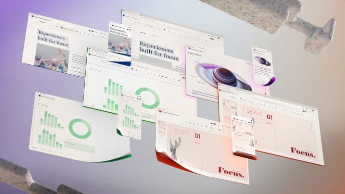
Microsoft has now given us a glimpse of its future Office UX, where popular apps like Word, PowerPoint, Excel, etc are getting a redesign. Changes shown in the teaser like moveable ribbon and others are aimed at decreasing the cognitive load, thereby increasing the productivity of the user, says Microsoft.
Microsoft Teased Redesigned UX of Office 365
Microsoft’s Word, PowerPoint, Excel, Outlook etc have been major apps relied by most types of businesses. These have saved the fortune of time by automating regular tasks and led users to work on something creative. And with the world moving more towards online and especially in these pandemic times, users are dependent on productive apps more than ever.
Thus, Microsoft has been evolving with innovative features to make them more helpful. And in a recent teaser released by the company, it revealed how the future Office UX would look like. The company has previously released many useful features like overhauling the ribbon toolbar, dark mode, new icons, etc. But now, it’s up to a whole new level.
John Friedman, the Corporate VC of Design and Research at Microsoft says, “The next wave of Microsoft 365 UX changes will go even further by fading brand colours from app headers and exploring adaptive commanding.” This includes letting you move the ribbon toolbar from top to wherever you like on the screen! This big change is aimed at easing your work and letting you place wherever you can make the most use of.
Friedman talks about Contextual Commands, where the ability of apps to follow your work and aid with relatable actions throughout. This could reduce the burden on your cognitive load and help focus on others. He further said the design details Microsoft has shown in the teaser will come in a year or two. And since most of them are still exploratory, we couldn’t expect everything to come as teased.

